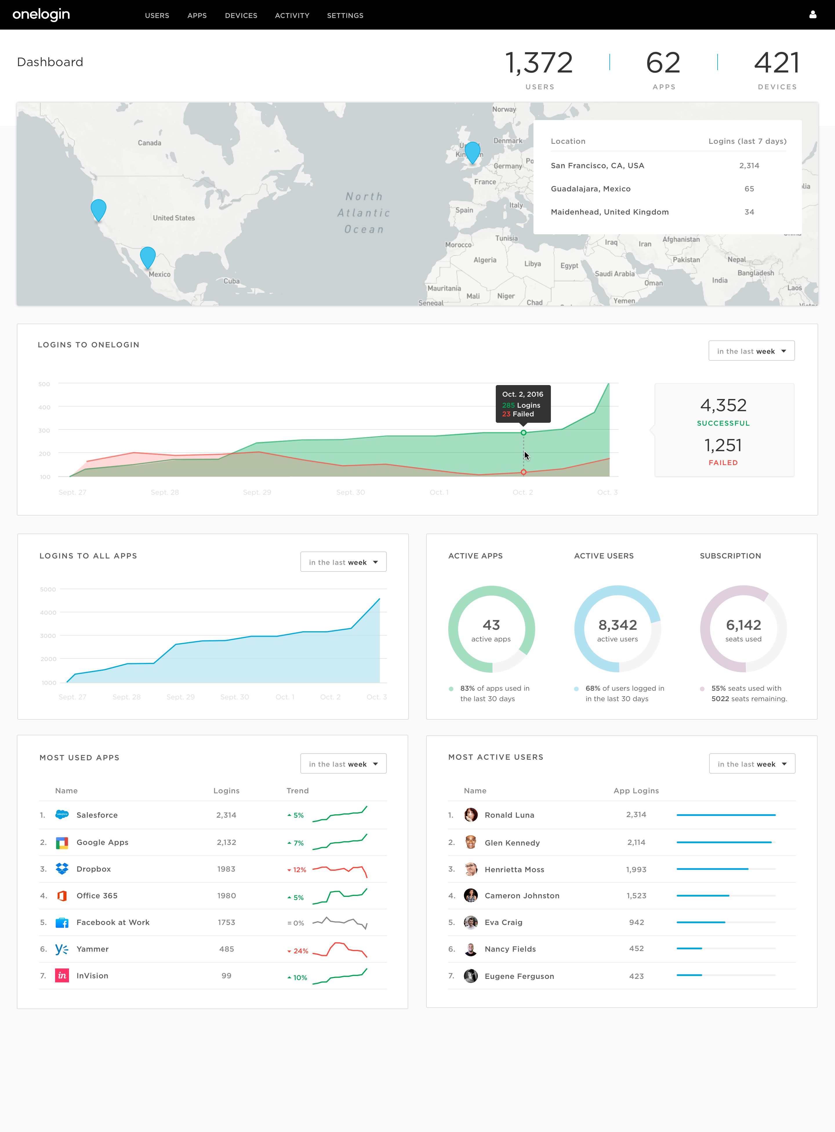
OneLogin helps IT admins manage all of
their organization’s users and apps. I designed a dashboard to empower
data-hungry admins with visualizations of how OneLogin is being
used across their organization. The goals were to demonstrate
business value and help admins sniff out potential
security threats.
Web AppUX Design • UI Design • Research
Process
This project began with plenty of good ideas. Our customer-facing 'Ideas Portal'
made it easy to ask users directly what they'd expect from such a UI.
We also exercised the creativity of our customers at our User Conference by
asking them to draw their ideal dashboard for their business and administrative needs.
These sources of input from our core user base helped shap the first set of wireframes.
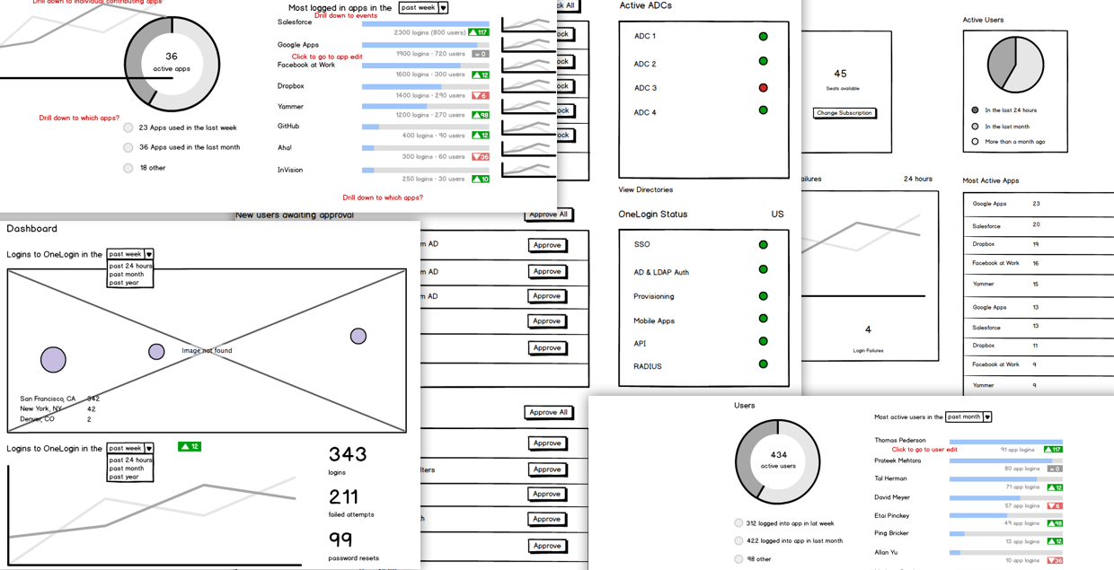
Early wireframes
We sought ways to categorize these charts into themes so that the Dashboard would flow in a logical manner.
In earlier prototypes, I categorized them into these buckets:
Authentication -- When and from where are my users logging in to OneLogin?
Activity -- How active are my users? What are the most actively used apps?
Users -- What are the statuses of my users?
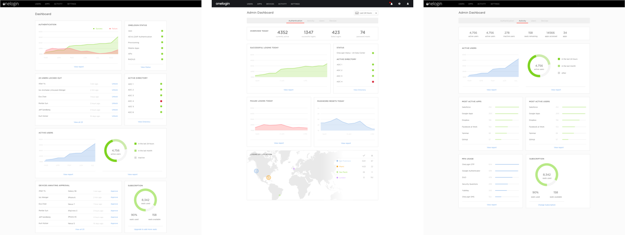
Early hifi prototypes. Too many things!
Final Design
When it comes to dashboards, it's easy to pile on more and more compelling use cases.
So it was important to narrow our focus to
just the core things that made sense and offered the most value to
customers. Our goals for the Dashboard were to:
Demonstrate business value
Display user activity to help sniff out suspicious activity
Use a responsive design so the content fills the page and works on mobile as users are on the go
 Web App
 UX Design • UI Design • Research